01 · The brand
Nutrition, the way it used to taste.
Green Poshan sells naturally grown groceries and preservative-free pantry staples — grains, pulses, spices, oils, pickles — processed the traditional way instead of the industrial one. The argument is that chemical fertilisers didn't just strip nutrition from daily staples, they changed how they taste.
From the packaging
GreenPoshan is a conscious effort to make better nutrition accessible to people through their food. The discriminate use of chemical fertilizers not only led to the loss of nutrition but has also altered taste of our daily staples.
MEDIACLANS SCOPEIdentity, packaging system across 100+ SKUs
SECTORNaturally grown food & pantry staples
CATEGORIES12+, from grains to gifting
BASED INNagpur, Maharashtra
One badge, a dozen categories.
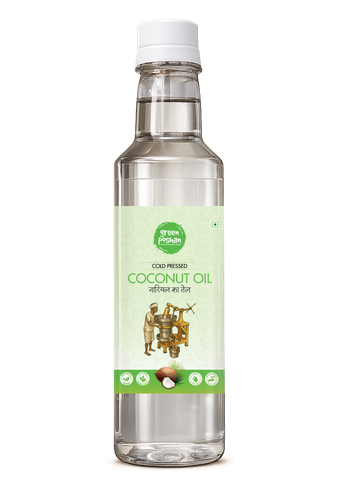
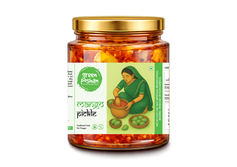
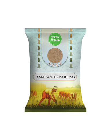
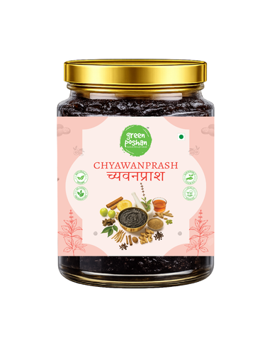
Every product carries the same circular badge and the same bilingual naming — English and Devanagari, side by side — but each category earns its own colour and its own scene: cold-pressing for oils, hand-ladled pickling for pickles, the harvest itself for grains. The system flexes; the mark never does.
Cold-Pressed Coconut OilMint ground · the press illustrated
Mango PickleCream ground · hand-ladled by illustration
Amaranth (Rajgira)Sky ground · the harvest illustrated
ChyawanprashBlush ground · ingredients photographed
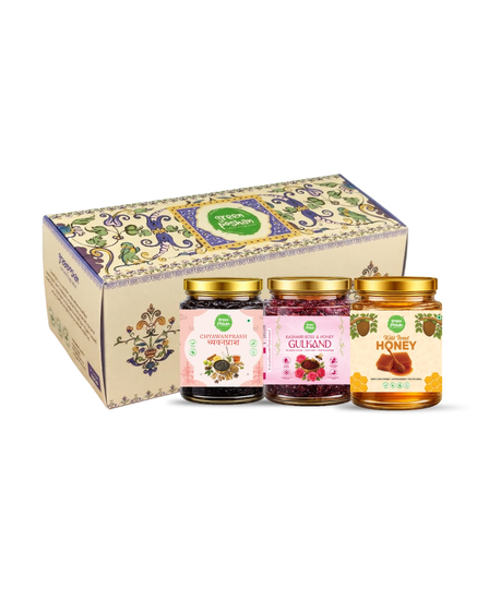
Gifting HamperOrnate box · three-jar curation
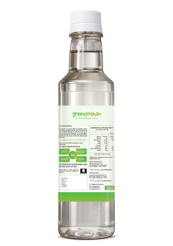
The back labelPhilosophy, FSSAI, full nutrition table
THE BADGESame circular mark, same placement, on every SKU — the one constant across twelve categories.
BILINGUAL NAMINGEvery product name set in English and Devanagari together, never one without the other.
CATEGORY COLOURMint for oils, cream for pickles, sky blue for grains, blush for wellness — a visual index before a customer reads a word.
THE SCENEA hand-illustrated process per category (the press, the ladling, the harvest) or real ingredient photography where that tells the story better.
THE BACKEvery pack carries the same structure: philosophy, farming process, full nutrition table, FSSAI licence — nothing hidden in fine print no one reads.
Why this held together across 100+ SKUs
A packaging system for a twelve-category grocery range lives or dies on restraint. The badge, the bilingual name block and the cert-icon row never move — only the ground colour and the scene change. That's what lets a shopper recognise a Green Poshan product from three feet away, whether it's a bottle, a jar or a pouch.
03 · In use
Grown into a full grocery range.
The same badge and philosophy now live across greenposhan.com and the full product range — naturally grown groceries, pantry staples and gifting, all built on the same promise.
 Nurture through nature.
Visit the live site ↗
Nurture through nature.
Visit the live site ↗